
Snowbirds
A desktop app for the avid senior traveler
Millions of Americans use online travel booking sites to purchase tickets for their trips all over the world.
However many of users of these sites are seniors, retirees, or disabled people who don’t fit the demographic that most travels sites are built for.
I wanted to find out what it was specifically that could be done to help cater to that user, and design a site around those findings.
The Problem
Most airline booking sites are designed with the same young to middle-aged demographic in mind.
Sites can be confusing and congested with un-needed or unwanted information
The Proposal
Investigate design features that appeal to upper middle-aged demographic.
Gain insight into how that demographic uses current competing sites.
The Solution
Created an MVP web based app that includes features for retirees, and people who are disabled.
Reduced the stress level for both the new and avid traveler when booking online flights.
Tools/Methodology:
Directed Storytelling / User Persona / Hand Sketch / User Flow / Wireframe / Interactive Prototype


Research
Through sleuthing I was able to discover some of the following pain points for our users regarding other travel booking sites:
Layovers were rarely addressed, and if they were not much information was given
There were way too many hidden fees
Prices were’t visible enough, this included tickets and anything additional
Comfort information such as where carryons were located, or how much leg room a user may have wasn’t made a priority
Usability in general was lacking, and made users think too hard about what they should or shouldn’t be clicking on
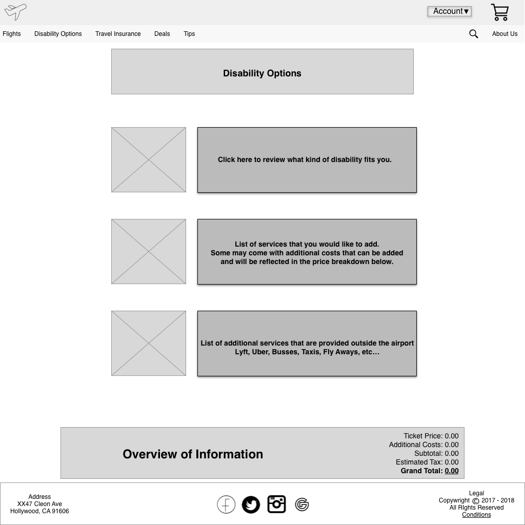
Often times disability options were never given, and if they were they were very difficult to find and poorly categorized
Travel insurance was a must on some flights, however many booking sites didn’t offer that on their own making the user search elsewhere
User Persona
With users pain points identified, I was then able to establish who I would be building our site for. I created the user persona Airline Annie who would be carried through the construct and designs.
Whether looking at architectural diagrams, sketching to wireframing, or brining the prototype to life, this persona was a constant reminder to what questions and what solutions needed to be asked.
Keeping in mind Airline Annie’s goals, frustrations, and motivations the user statement came into focus:
“I am a senior retiree with a possible disability that is looking to book a flight with ease. I want no hassle, and all the options conveniently laid out for my convenience.”


Ideate
I really wanted to create a site that was simplistic in design, but still fulfilled the needs of the user. I wanted to make sure the user knew where everything was the moment they arrived at the home page, which should include the call to action button finding their flight, as well as the ability to skip around a bit using the nav bar.
There should also be a place on the page where the user can find popular spots to vacation for the retiree/experienced flyer with free time to spare. At the same time it was equally important to have tips and tricks for the novice flyer who might otherwise not know some in’s and out’s when flying.
In order to get all the ideas out, I sketched some designs that would later be digitized into wireframes.
User Flow
In order to make sure the site was fluid, I built out an architectural diagram to help visually see where users should be able to navigate to.
Like any good investigatorial tool, once it was built out, I realized that the flow may be a bit more complicated then anticipated. In order to combat that, I simplified the amount of pages required for the site, and gave each site a few more options.
Once this final diagram was put together the user hierarchy made much more sense to the user statement.


Prototype
Once these sketches were transformed from ink to pixel as wireframes, a realization that some of the initial ideas for where these services and clickable links were located didn’t make sense to the user statement. It was important I stayed true to the users, and had the the site be visible, while allowing them quick and easy access to the services they needed such as disability options, and layovers being on the forefront.
Upon further review into our architectural diagram, the site needed some tweaking in order to be properly used as intended.
The find your flight option also needed to be completely reworked, as the original intent of making this option something smaller, needed to be seen as a bigger more important option. Folding this specific section into the main story arch while booking a flight, shed light on the comfortability of flights and comparable options.
After all was said and done, the prototype was finally ready for the initial rounds of usability testing.